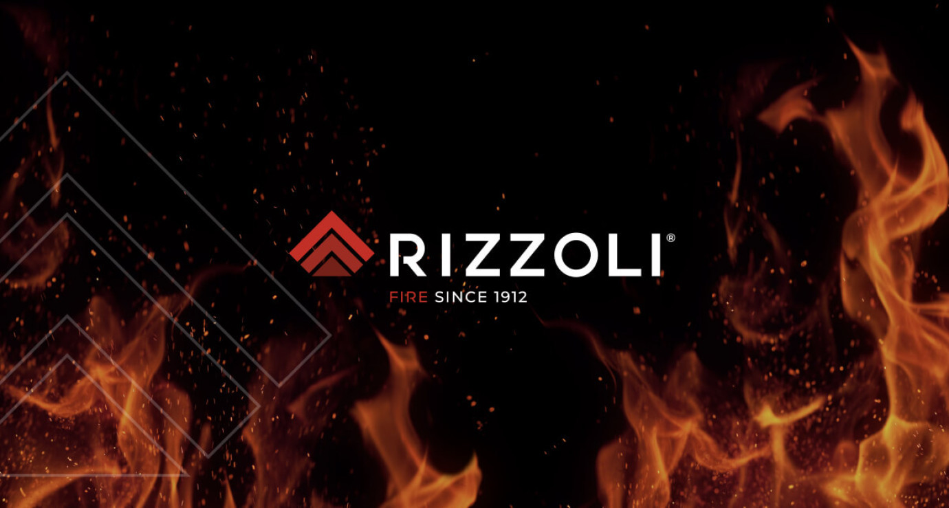
The new Rizzoli logo comes from fire and points to the future
An exciting chapter is beginning for Rizzoli, leader in the wood-burning cookers and thermo-cookers sector and innovative manufacturer of wood-burning stoves, thermo-stoves and extractor hoods. It features a new logo, created by Tunnel Studios, and pays homage to the company's 111-year history of cookers and wood-burning stoves. Thus the beginning of a journey aimed at affirming the new corporate identity is sealed, which looks to the future with the great certainty of having its history in mind!

Made as they once were, but perfect for the present is the characteristic of excellence, distinctive of every Rizzoli product, which is born from the power of fire with craftsmanship, to then be shaped by unceasing passion and cutting-edge technology, constantly in evolution.
Rizzoli's new identity arises from the intersection between body and spirit, between rationality and magic, from a primordial system of transformation of matter: Alchemy. Understood in its original and ancient meaning with its languages and its symbols, it was the cornerstone of the study and graphic creation.

In fact, the new logo comes from a square module, just like Rizzoli products which are then processed, cut and positioned to reveal the shapes that lead them to take on a new visual identity. Once "cut", this module has been rotated 45 degrees to the right, ideally projecting its gaze towards the future and becoming a rhombus that stabilizes firmly on the ground, making part of its base disappear.
Metaphorical symbol of a reality projected towards tomorrow with the foundations firmly anchored to its history and tradition.
This rhombus thus becomes a metaphor and citation of an alchemical triangle, a symbol of fire, made up of three elements, a number which in metaphysics represents the mental sphere (thought), which indicates the door to the conscious and rational mind. Fulcrum of the left hemisphere and key to memory, which associated with the triangle defines the perfect harmony between mind, soul and body.
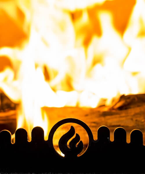
The new logo aims high to always look beyond. It arises from the special alchemy between the two souls that are released right from the fire, the real and extremely fascinating one given by the combustion process, and the magical, more irrational one that captures, aggregates and enchants.
“With our new logo - declares Rizzoli Gianluca di Rizzoli - we are ready to reveal and share our renewed corporate identity, also involving traditional and digital media. In this important and strategic project we have Tunnel Studios, Rizzoli's historic communication agency, at our side, confirming the success of a consolidated collaboration of over 7 years."
“Only a deep and long knowledge of the values and culture of the great Rizzoli family has allowed us to be able to dig deep to bring out the new soul that is completely detached from the image of the past to leave space and breathing space for the corporate DNA. – underlined Federico Gualtieri and Luca Bergo Ceo of Tunnel Studios – The concrete/abstract, matter/spirit, literal/metaphorical dualism stimulated our thinking, which then took shape in the creation of the new image.”

Finally, the new graphic image of Rizzoli highlights two corporate values of essential importance: the reference to the mountains of Trentino-Alto Adige, its territory of origin, and the heat that each of its products releases, made tangible by the colors of the flame. Two elements that have made it possible to convey a warmer expression of the brand, together with a pleasant and more linear shape, offering that sense of serenity and stability that only an aware and courageous company can give.
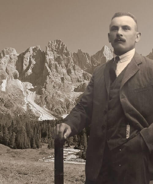 Our history
 Our philosophy of the best
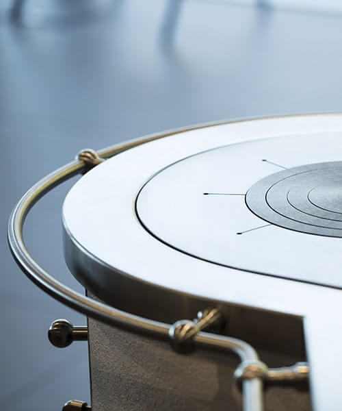 Handmade quality
 Italian manufacturing
 Wood-burning Cookers
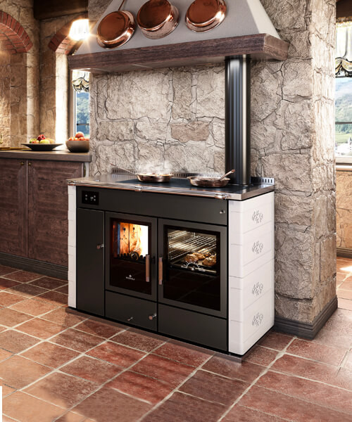 Wood-burning thermo-cookers
 Electric and gas kitchens
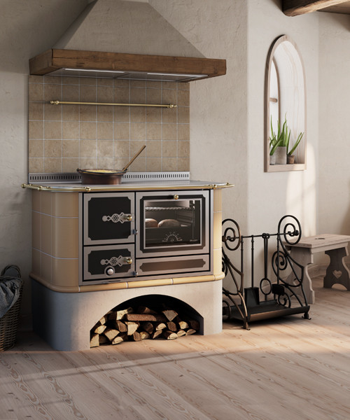 Items for stove makers
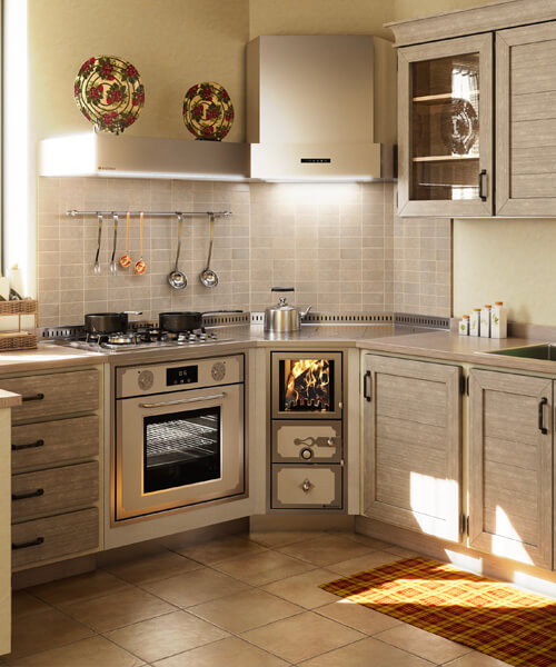 Custom made
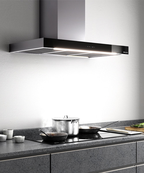 Kitchen hoods
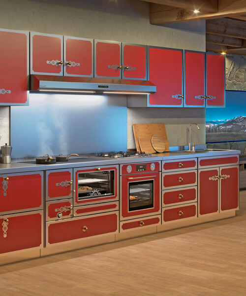 Worktops, Furniture and Sinks
 Wood-burning stoves
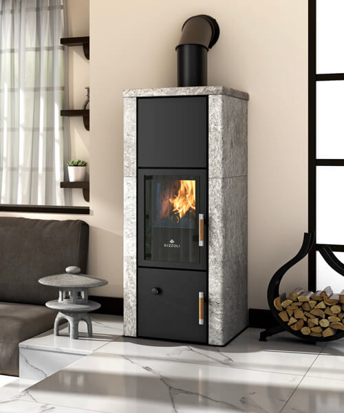 Wood-burning thermo stoves
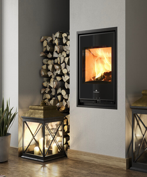 Wood burning insert
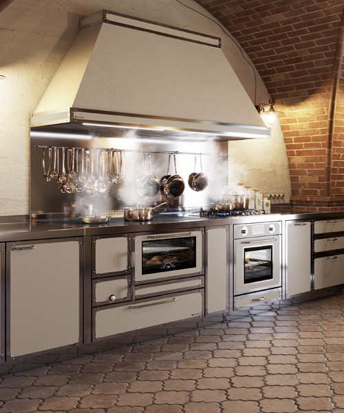 Wood-burning Professional cookers
 Suggestions
 Configurator
 Rizzoli in fair
 Rizzoli in tour
 Latest news
 Contacts
 Work with us


